Pablo Garrigos Ibañez
Actions :
Brand Logo / Corporate Identity.
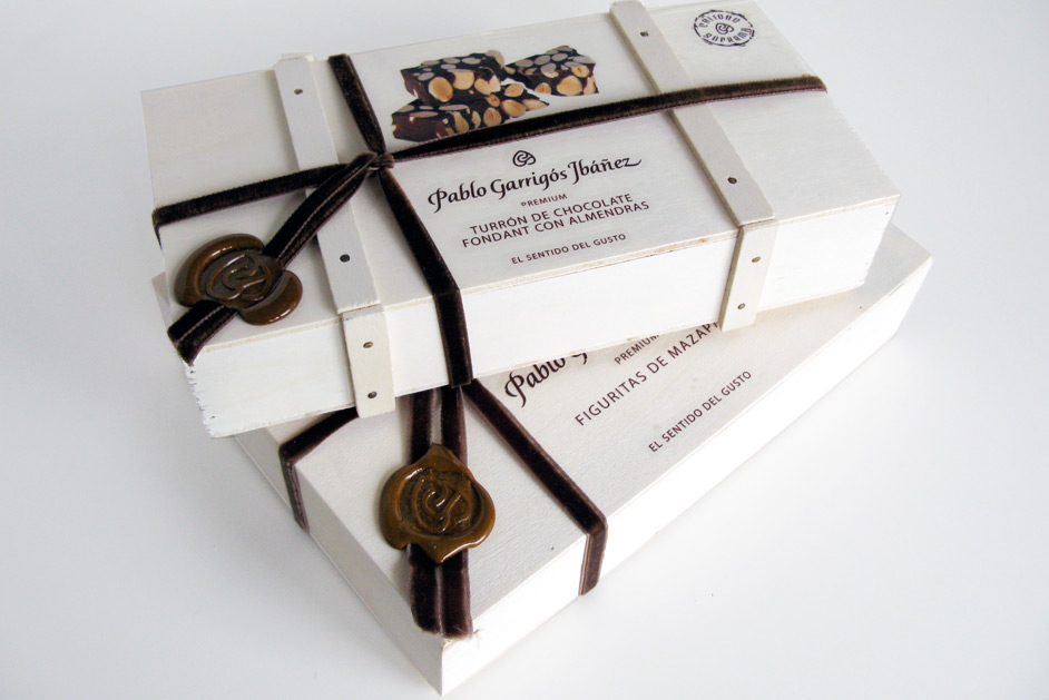
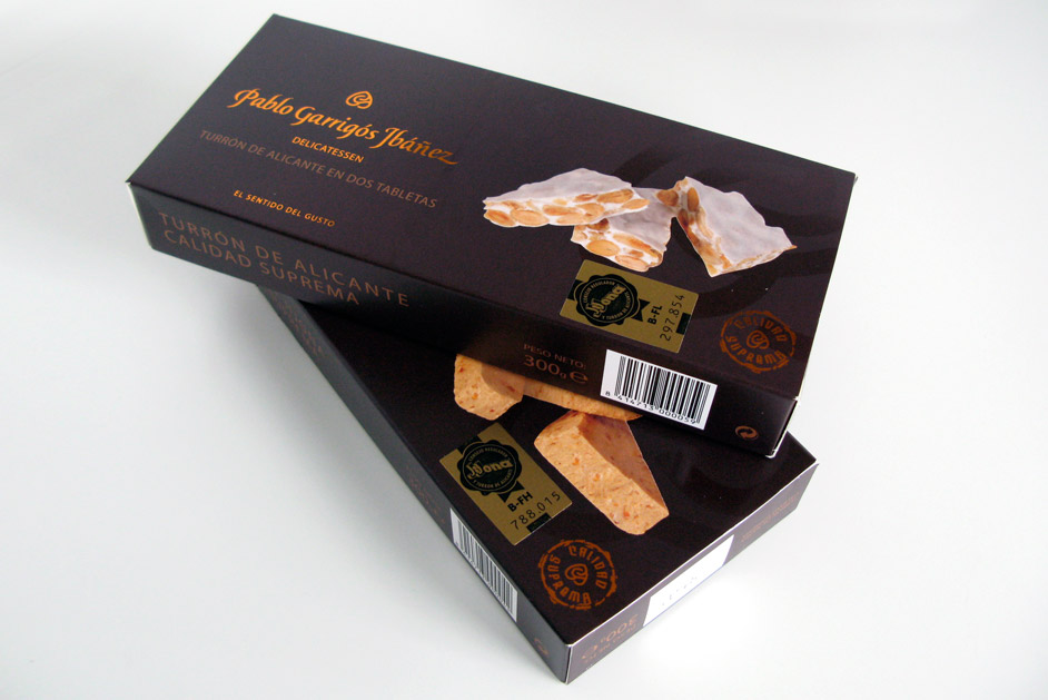
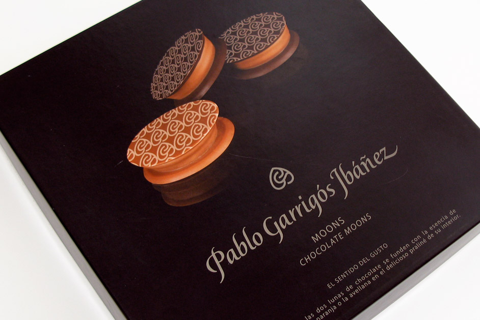
Packaging / Visual Identity.
Link / website
Share /
/ High-quality nougat and gourmet sweets
Pablo Garrigós Ibañez .-
/ Pablo Garrigós Ibáñez is synonymous with supreme quality, gourmet products, and deeply rooted traditions.
CHALLENGE ⌜
The advertising agency Contrapunto Levante proposed that we find a design that maintained the client’s established trajectory but with a more readable and modern image, suitable for the new line of chocolates and bonbons they planned to market.
We established the foundations for a brand construction that is consistent with their projection and intended positioning of luxury in the minds of their consumers.
The Pablo Garrigós Ibáñez logo is a beautiful and sophisticated representation of a high-quality delicatessen. The elegant script of the name, combined with the delicate gold color, conveys a sense of luxury and tradition. The heart-shaped symbol adds a touch of warmth and personality, suggesting a family-owned business that cares about its customers. Overall, the logo effectively communicates the brand’s commitment to exceptional taste and craftsmanship.
• Previous / Next •
