Café Jurado
Actions :
Advertising / Brand Logo / Corporate Identity.
Packaging / Visual Identity.
Link / website
Share /
/ Roasting, manufacturing, and production of coffee
Café Jurado .-
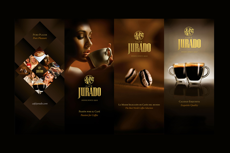
/ The objective was to design a brand logo and applications that could show the evolution of the company.
CAFÉ JURADO GROUND COFFEE ⌜
Brand restyling and creation of visual identity for packaging. The branding of Café Jurado reflects a refined and classic approach, emphasizing tradition and quality. The use of gold tones gives the logo an elegant, premium feel, perfectly aligning with the brand’s heritage, as indicated by the “Desde/Since 1912” tagline. The emblem featuring coffee leaves and beans subtly conveys a connection to the natural origins of coffee, while the bold, serif typography of “JURADO” reinforces the brand’s enduring legacy and strong market presence. This design balances tradition with sophistication, appealing to consumers who value authenticity and time-honored craftsmanship.
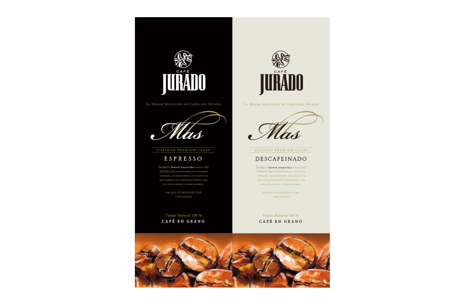
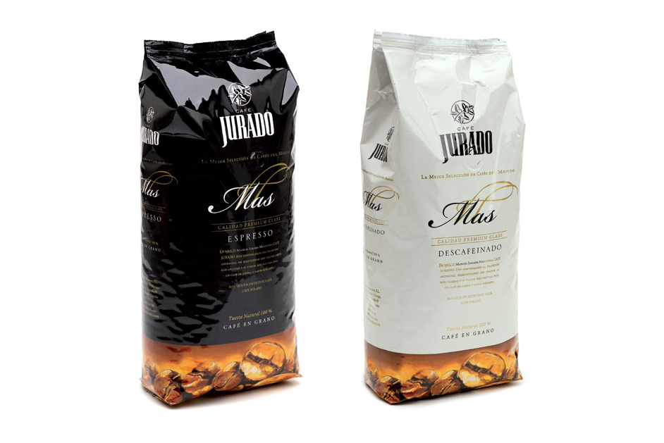
For the new packaging design, we needed to retain the essence of the previous corporate identity. To achieve this, we enhanced the color codes that were being used for the different coffee types. These new color codes allowed us to improve the photography and complement it with shapes and typography specifically created for the product names.
CAFÉ JURADO ORGANIC ⌜
We were tasked with creating a design that represented the product’s natural character while clearly differentiating it from other commercial coffees. We used a clean, minimalist typographic design, added an organic element in the form of a quality seal, and printed the entire design on untreated material to represent its natural origins.
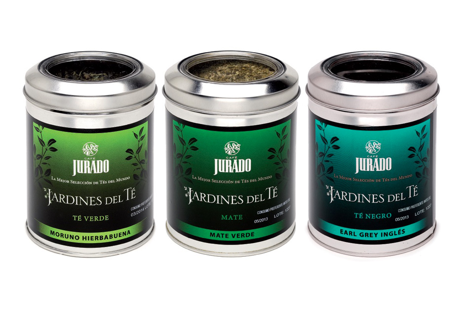
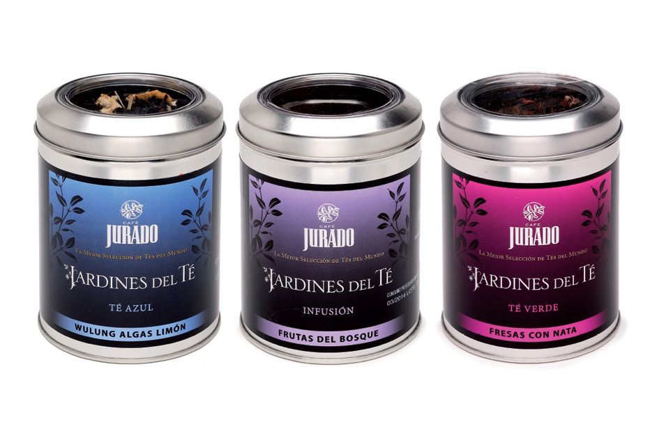
JARDINES DEL TÉ (TEA GARDENS) ⌜
We designed a new visual identity for this family tea, with the objective of creating a design based on color codes that, together, would form a unique, clear, and harmonious image. This design aimed to make a stronger impact and create the effect of a larger package.
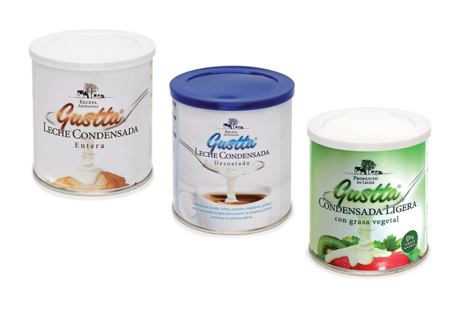
GUSTTA – CONDENSED MILK ⌜
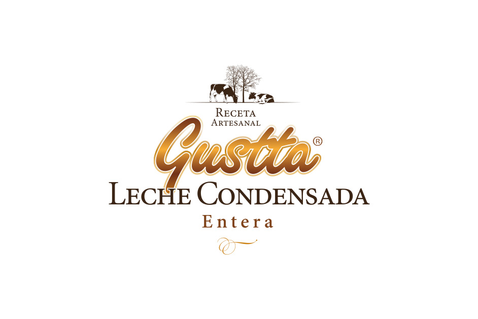
The name we chose, “Gustta,” is a clear allusion to the experience of tasting and enjoying milk. Both its phonetics and typographic forms are pleasant, memorable, and successfully align with the product concept. The white background of the packaging enhances the feeling of purity and quality.
• Previous / Next •

