Client :
Clickair
Actions :
1 / Brand Logo / Corporate Identity.
Corporate Manual / Visual Identity.
Link / –
Share /
/ Airlines
Clickair .-
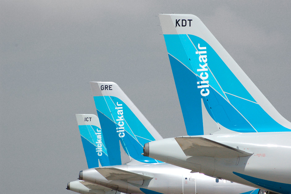
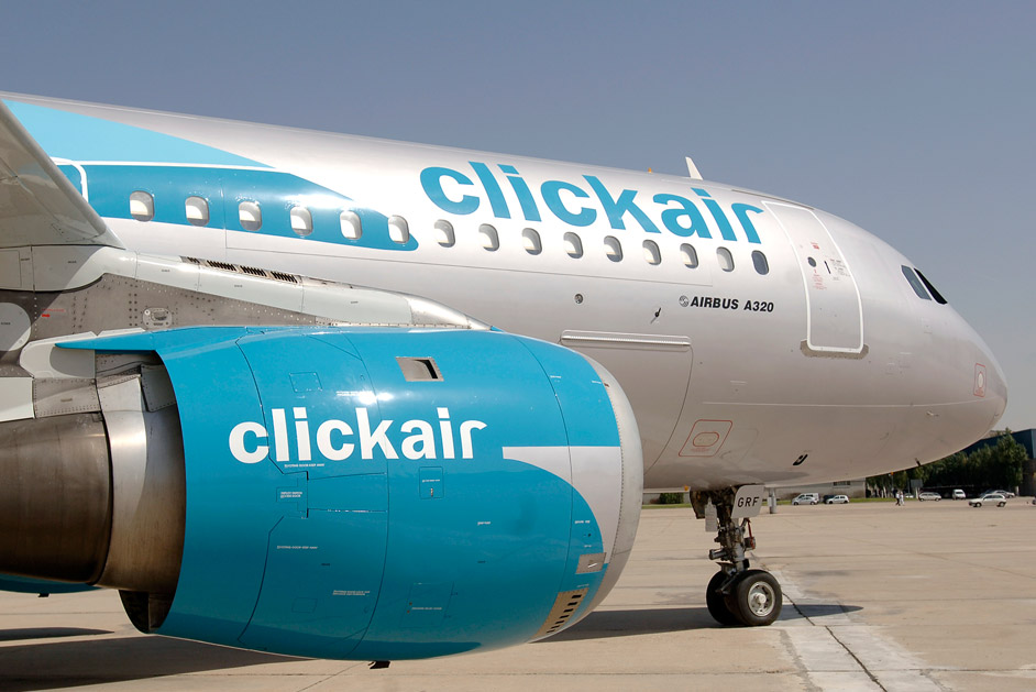
/ The objective was to design a brand image that could be applied to the airline’s fleet and convey a new concept for a low-cost carrier.
COMMISSION ⌜
The brand would occupy a “third way,” positioned between the current offerings of low-cost airlines and traditional carriers. Iberia would only align with an image that communicated a certain level of class and security.
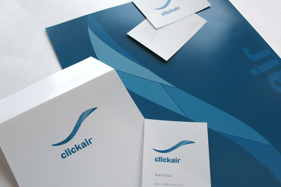
The symbol, the central element of the identity, featured dynamic and fresh forms inspired by energy waves and movement, with a clear nod to Gaudí, knowing that the headquarters would be established in Barcelona. This was complemented by a simple and minimalist logo that embodied the essence of the company’s operations.
/ It was important to focus on the emotional impact conveyed by the planes.
APPLICATION ⌜
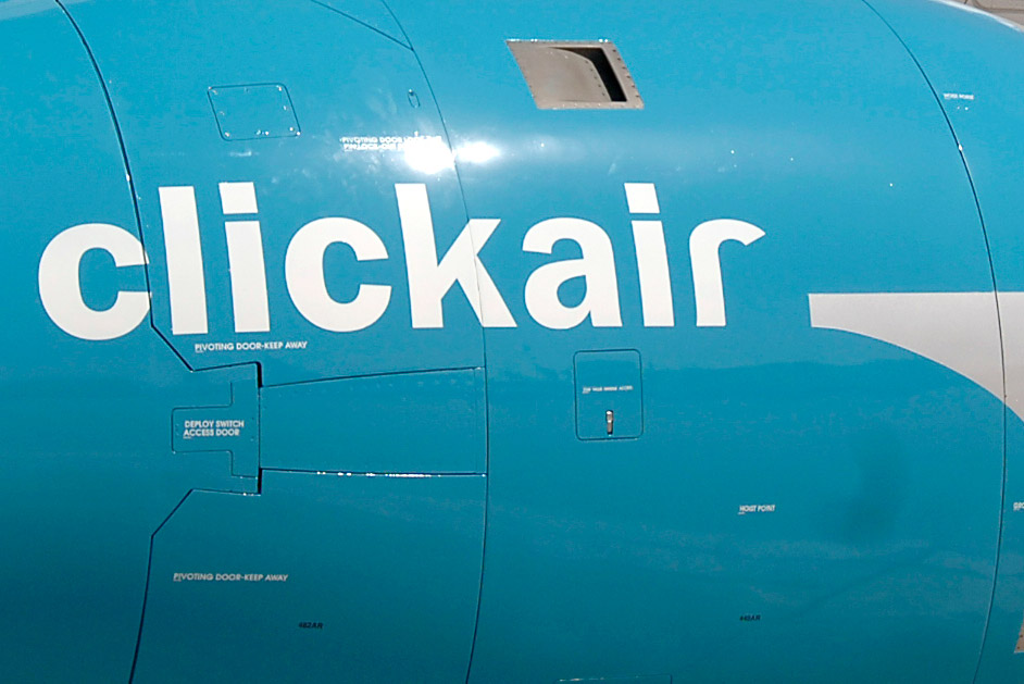
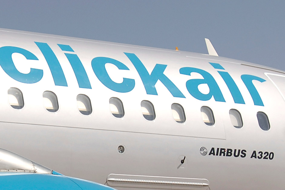
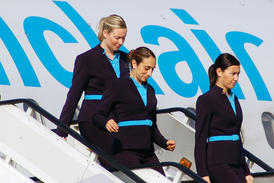
The symbol wraps around the aircraft, giving it a sense of lightness and freshness, allowing it to blend more naturally into its environment, in the air. Silver-gray tones were chosen as a distinguishing feature, giving the aircraft a modern, cutting-edge appearance.
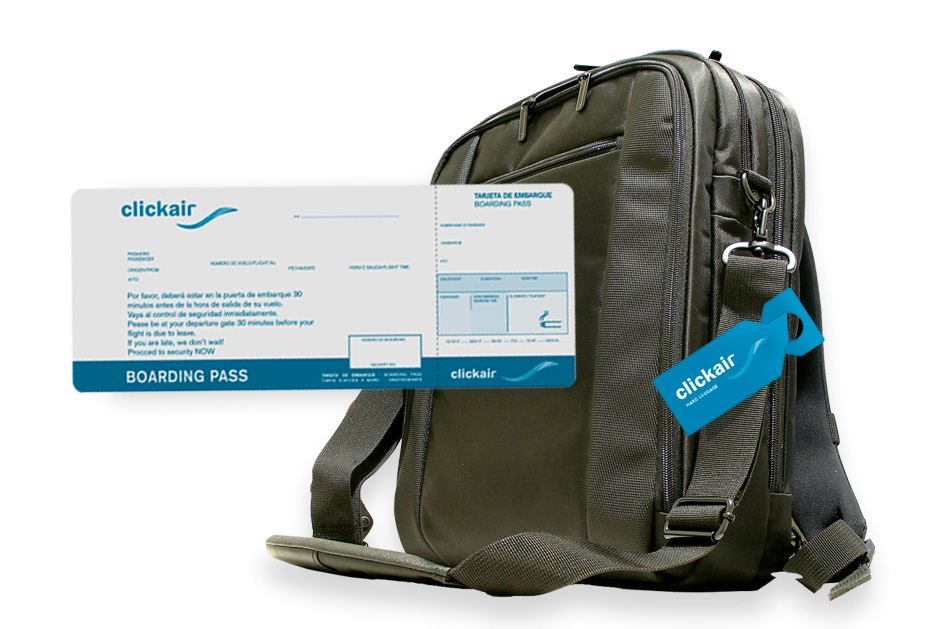
This was included in the comprehensive Identity Manual, where all the applications of Corporate Identity could be seen and used for a consistent visual identity and communication.
• Previous / Next •


