Client :
Galdarica
Actions :
1 / Brand Logo / Naming.
Packaging / Visual Identity.
Link / –
Share /

/ Galdar Premium Gold Pineapple
Galdarica .-
/ Renaming to align with its new strategic objectives. Redesigning its corporate image with a minimalist eye symbol and green tones to convey its brand essence.
COMMISSION ⌜
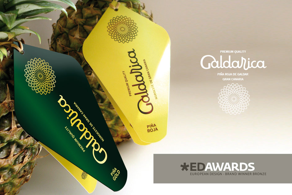
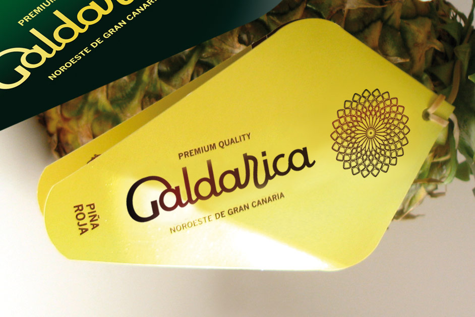
The objective was to create a corporate visual identity for two unusual varieties of premium-quality pineapples that are economically accessible and organically grown. We developed a logo that reflects the organic nature of the pineapple, incorporating cheerful shapes that represent the tropical essence of the fruit. For the symbol, we chose a graphic representation of the pineapple viewed from the base, illustrating a natural aesthetic phenomenon known as “phyllotaxis,” which is exhibited by only a select few fruits.
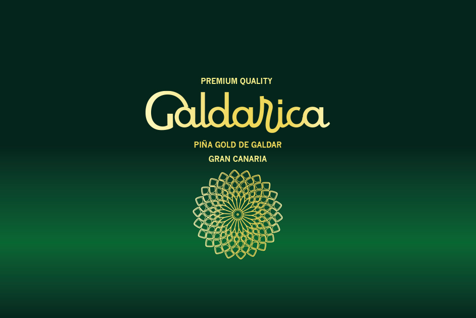
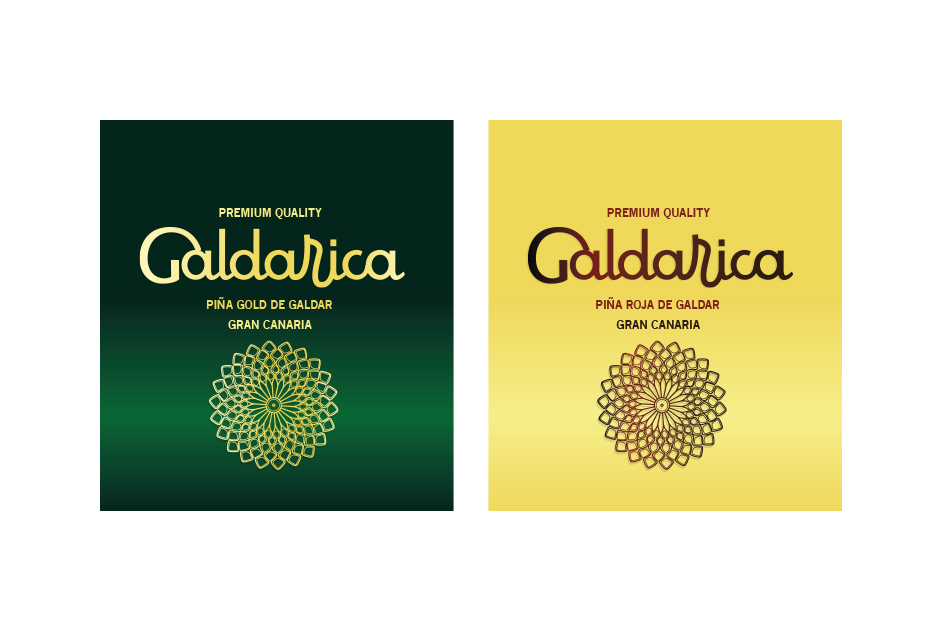
The Galdarica logo successfully conveys a premium and elegant brand identity. The use of gold in the typography and the phyllotaxis mandala-like symbol reflects high quality, aligning well with the message of “Premium Quality” for its product, which is Piña Gold de Gáldar from Gran Canaria. The choice of gold on a dark green background and the opposite, creates a strong contrast, which enhances readability while also evoking feelings of natural richness and freshness—qualities important for a premium fruit product.
The custom script-style font for “Galdarica” has a smooth and flowing form, which adds a sense of craftsmanship and tradition, suggesting that the product has heritage and care in its production. Overall, the design reflects a high-end, sophisticated brand that highlights both natural quality and luxurious appeal.
• Previous / Next •


