Grupotec
Actions :
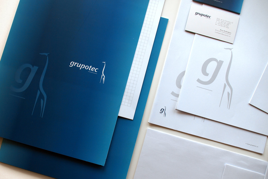
1 / Brand Logo / Corporate Identity.
Corporate Manual / Visual Identity.
Link / website
Share /

/ Engineering and Renewable Energy
Grupotec .-
/ The evolution of the company and new future perspectives, particularly on an international level, led Grupotec to consider a change in its visual identity.
COMMISSION ⌜
Initially, their approach was simple: a “restyling of the current brand.” However, they soon realized that their vision and strategic plans were not aligned with the image the company was currently projecting, and a more substantial change was necessary.
This transformation needed to represent not only their business project but also the essence and emotional structure of the company. Grupotec had achieved a high level of refinement in its various work processes, but its image failed to convey the crucial fact that people were at the heart of the company’s purpose.
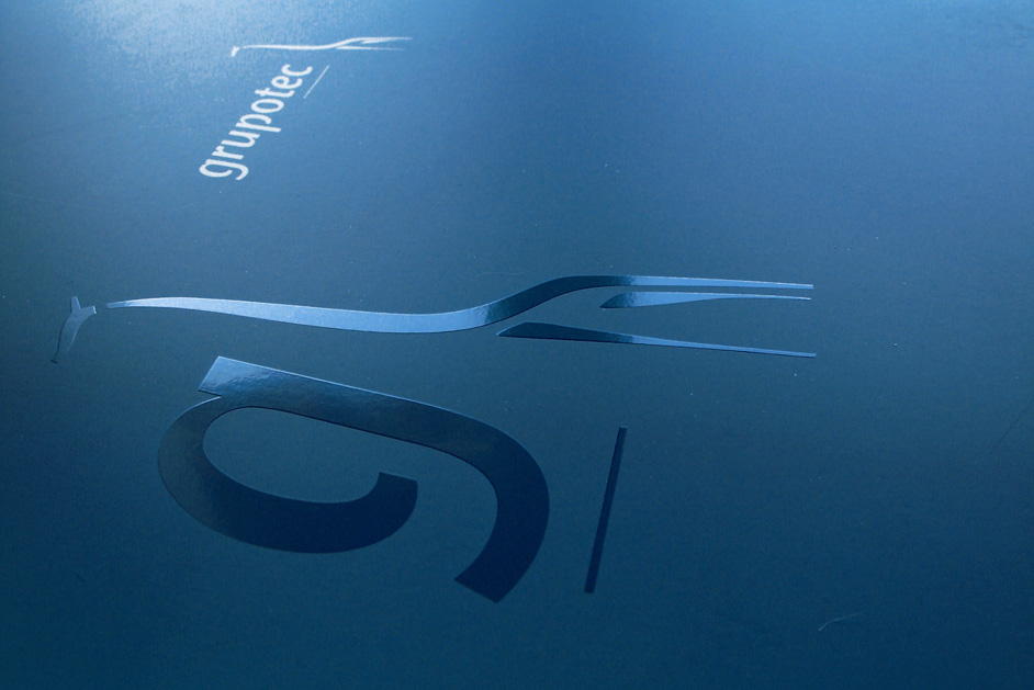
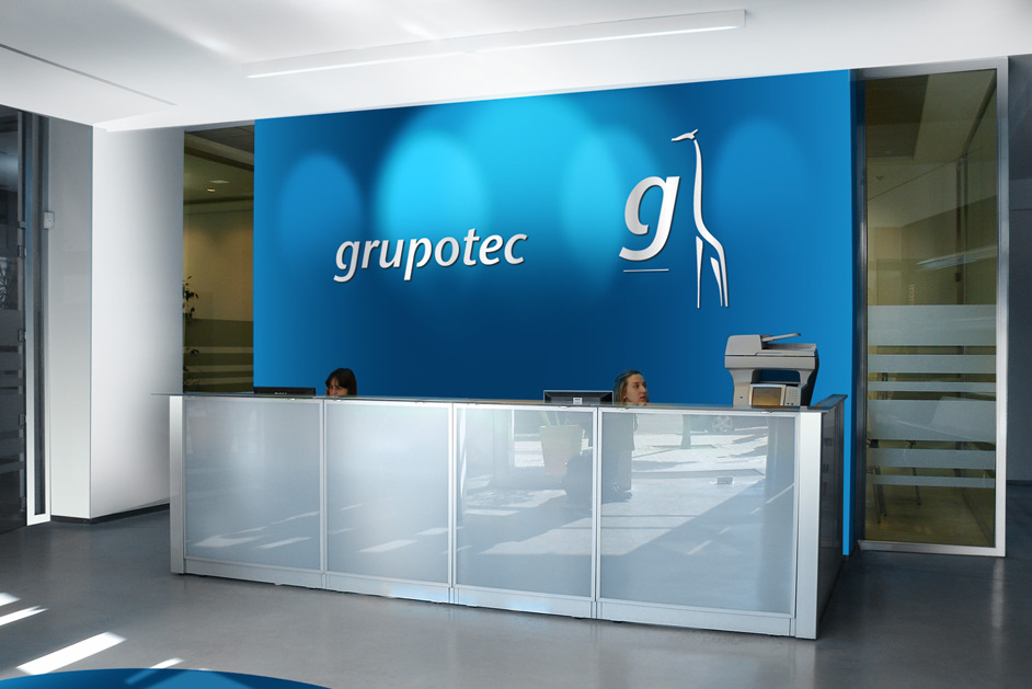
We began by focusing our efforts on creating a logo that projected a more natural, clear, human, accessible, and powerful image. We designed a balanced typography that also identified as modern. For the symbol, we chose the image of a giraffe, as it faithfully reflects the values of the company’s leaders: “looking far ahead from the highest vantage point, but with feet firmly on the ground.”
The “grupotec” logo has a modern, approachable, and clean design that conveys professionalism and energy. The lowercase typography in “grupotec” adds a friendly and approachable feel, while the slight underline emphasizes a solid foundation and reliability. The simplicity of the font makes the logo easy to recognize and read, giving the brand a no-nonsense, straightforward image.
The giraffe symbol is an interesting and creative touch, symbolizing vision, height, and forward-thinking. This, combined with the tagline “Un Futuro lleno de Energía” (“A Future Full of Energy”), reinforces the brand’s focus on innovation and sustainable growth, adding a dynamic, optimistic flair to the design. The blue color further conveys trust and stability, making the brand feel both reliable and forward-looking.
• Previous / Next •


