Client :
Natui
Actions :
Brand Logo / Branding / Corporate Identity.
Visual Identity / Website Design.
Link / –
Share /

/ Nature, individual, and the internet.
Natui .-
/ Based on the project’s values and its concept of ‘Creative Nature that Unites,’ we decided to develop the naming through a research approach that encompassed the three key elements: ‘Nature,’ ‘you,’ and ‘internet.’ The result: Natui.
PROJECT ⌜
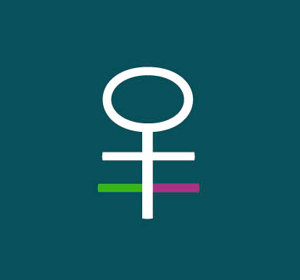
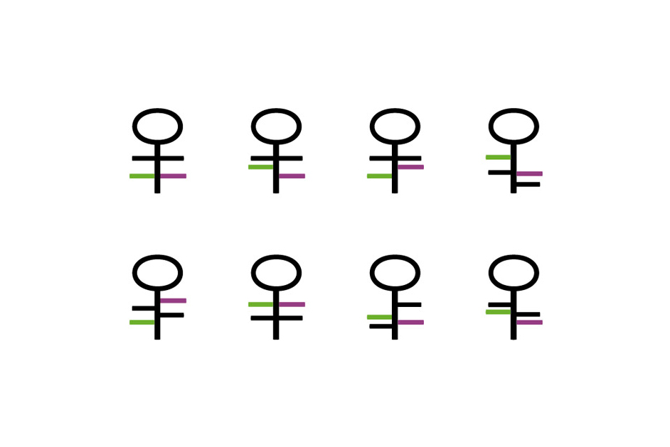
The branding and design of the Natui logo and symbol reflect a balance between modernity, nature, and human connection. The logo combines friendly, approachable lettering with a symbol that is both technological and organic. The symbol itself, a stylized form, merges human-like shapes with elements reminiscent of hieroglyphic writing and nature. This blend creates a design that is timeless yet adaptable, aligning with Natui’s concept of “Creative Nature that Unites.”
The use of clean lines and simple geometry in the symbol allows for versatility in digital and corporate applications, while the soft curves of the typography evoke a sense of warmth and approachability. The combination of green and magenta lines adds a vibrant touch to the design, symbolizing growth and creativity. The overall branding captures the essence of unity between nature, people, and technology, making it visually engaging and conceptually rich.
• Previous / Next •


