Q-verde
Actions :
Brand Logo / Claim / Tagline.
Iconography / Visual Identity.
Link / –
Share /

/ The Qverde line from BASF
Q-verde .-
/ The Q-verde logo by BASF/Nunhems combines modern design with sustainability, using a green palette and clear iconography to emphasize agricultural innovation and exceptional cucumber variety quality.
PROJECT ⌜
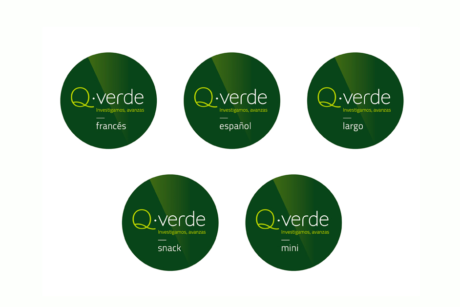
The branding and design of the Q-verde logo for BASF/Nunhems conveys a strong emphasis on sustainability, innovation, and agricultural excellence. The bold and clean visual identity centers around a green color palette, evoking natural growth and health, which is particularly fitting for a product line focused on high-quality cucumber varieties. The circular logo, with its minimalistic, modern design, is complemented by a sleek font and the tagline “Investigamos, avanzas” (meaning “We research, you advance”), reflecting the company’s dedication to continuous agricultural innovation.
The iconography below the logo introduces visual elements related to specific resistances and characteristics of the varieties, such as Oidium, CVYV, and other plant diseases, which clearly communicates the technical strength of the product line to its audience of agricultural professionals.
This logo effectively balances the technical precision needed in the agricultural industry with a fresh and accessible aesthetic, promoting Nunhems’ leadership in cucumber breeding under the Q-verde brand.
• Previous / Next •


