
/ Online Search and Compare
Rastreator .-
/ The Rastreator brand was facing the need for a repositioning. As the brand evolved, a lack of differentiation led to a re-evaluation of its direction.
CHALLENGE ⌜
Several companies with similar offerings had emerged, most with a fresh, digital, and fun positioning. Darwin&Co, the agency responsible for their advertising communications, was tasked with providing a new perspective and strategy for the brand’s positioning and communication. Our role was to translate this into a tangible, visual corporate identity, as the existing brand image no longer aligned with the company’s new values and direction. The challenge was to transform a successful brand into a global and highly desirable one.
SOLUTION ⌜
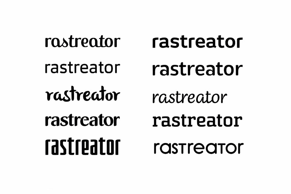
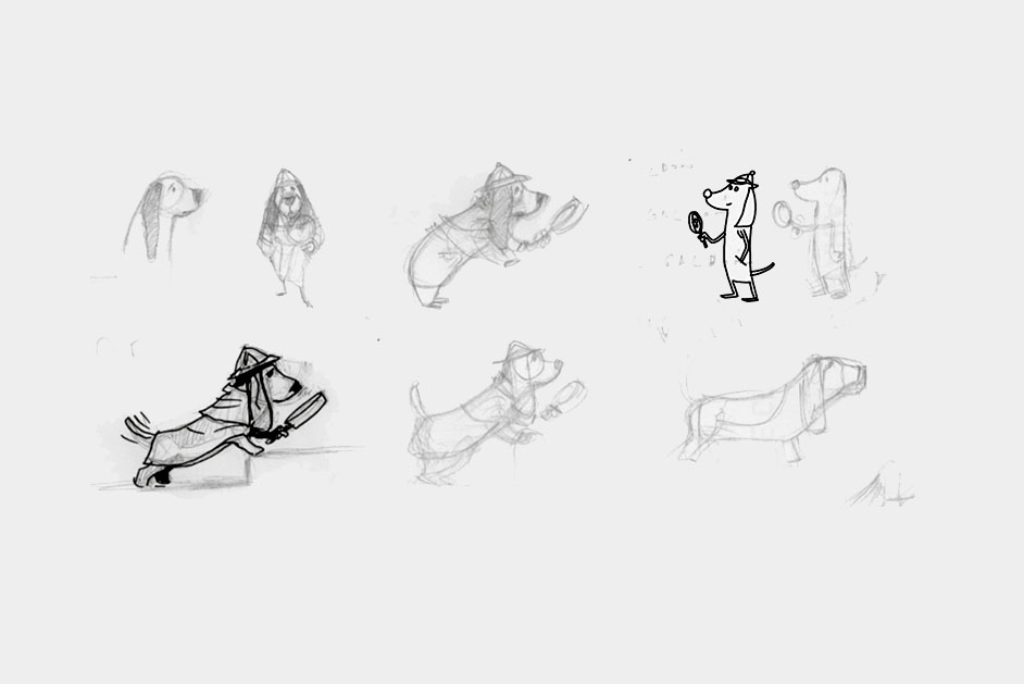
We revamped their primary brand image. Up until that point, the brand had used a playful depiction of a basset hound wearing a cap, trench coat, and magnifying glass, which reflected a fun but somewhat outdated style. We modernized the character, making it more figurative, contemporary, and endearing, while reinforcing values like credibility, security, efficiency, trust, and approachability. We refined and enhanced the typography and streamlined the visual identity of the brand.
RESULT ⌜
The result was an image that conveyed undeniable confidence in the quality of the product and the brand’s new values. The new character in the logo inspires affection and, by extension, the desire to use the brand’s services and connect with its image.
/ Rastreator Concept (Proposal).
In 2014, together with Darwin&Co (now DarwinSocialNoise), we created the Rastreator logo with the aim of repositioning the brand.
We began with a Sherlock Holmes-inspired Rastreator, and from there, we sought to humanize the character, giving it a more sophisticated and polished appearance.
During the design process, this concept emerged, offering countless possibilities. So much so that we even envisioned an animated series featuring short sketches focused on comparisons, with a hint of mystery, where “Rastreator” made brilliant decisions.
In the end, this concept was not presented, as the decision was made to focus on different positioning and values. However, we believe it’s worth revisiting, at the very least, to appreciate the depth of work that goes into creating a symbol.


• Previous / Next •