Client :
SENSIA by Mercedes Benz
Actions :
Advertising / Brand Architecture / Brand Logo / Corporate Identity.
Illustration / Naming / Signage / Visual Identity.
Link / –
Share /

/ Mercedes Benz Corporate Social Responsibility
SENSIA / Mercedes Benz .-
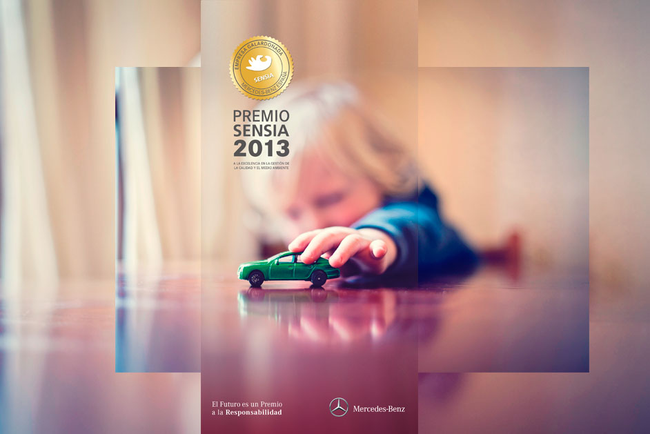
/ Mercedes-Benz Spain sought to reward dealerships and workshops within its sales network that had exceeded a series of quality standards.
COMMISSION ⌜
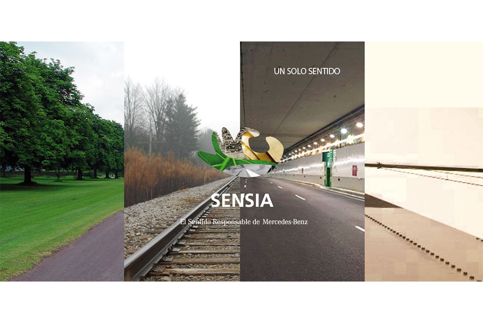
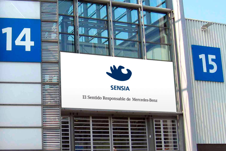
In 2008, the company began shaping an entire concept that not only included the creation of a prestigious award but also the introduction of a representative brand, Sensia—a name developed for its corporate social responsibility branch.
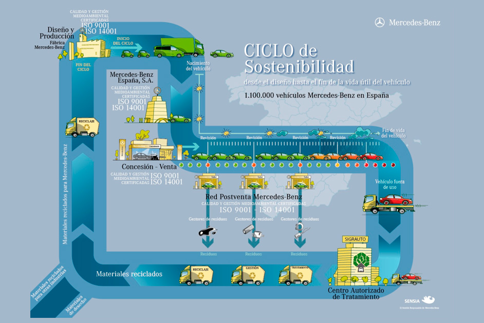
The etymology of its verbal identity stems from the word “Sense” and the concept of a “Harmonic Management System.” The aim was to provide reliability and consistency to an entire system of certification, training, and management whose ultimate purpose is to help the entire Mercedes-Benz network achieve quality standards that ultimately benefit both the consumer and advocates of its vehicles.
HAND & PHOENIX SIMBOLS ⌜
Hand: the hand that acts, gathers, and offers. It is reminiscent of the “Ok” gesture, closely associated with quality.
Phoenix: the emotional component of the symbol—change, rebirth, and recycling.
COLOR ⌜
Blue: increasingly recognized as a symbol of ecology, as the planet we live on is predominantly blue.
• Previous / Next •


