Client :
SURI
Actions :
Brand Logo / Corporate Identity.
Naming / Visual Identity.
Link / –
Share /

/ Shelter Units for Rapid Installation
SURI .-
/ The SURI branding effectively combines minimalist design and symbolism to convey resilience, safety, and hope, aligning with its mission of providing rapid, reliable shelter solutions in emergencies.
CHALLENGE ⌜
Suri is an innovative concept born from the aftermath of the Lorca earthquake, designed as a rapid-build module to provide a dignified, humane home for refugees who have been displaced. The challenge was to create a brand that conveys the seriousness of the product’s purpose while also bringing a sense of joy, positivity, and hope to refugee camps. Highlighting the speed of constructing these modular shelters was crucial.
SOLUTION ⌜
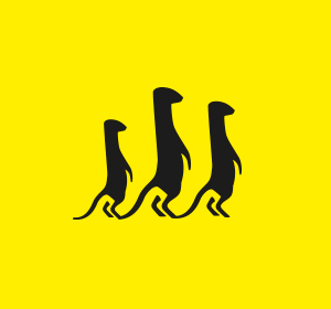
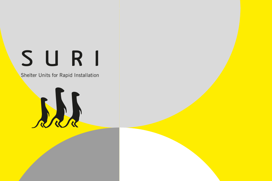
The branding concept revolved around meerkats—small mammals that adapt quickly to extreme environments and build their homes swiftly, embodying the product’s key qualities. The symbol features a family of meerkats, watchful and looking in the same direction.
RESULT ⌜
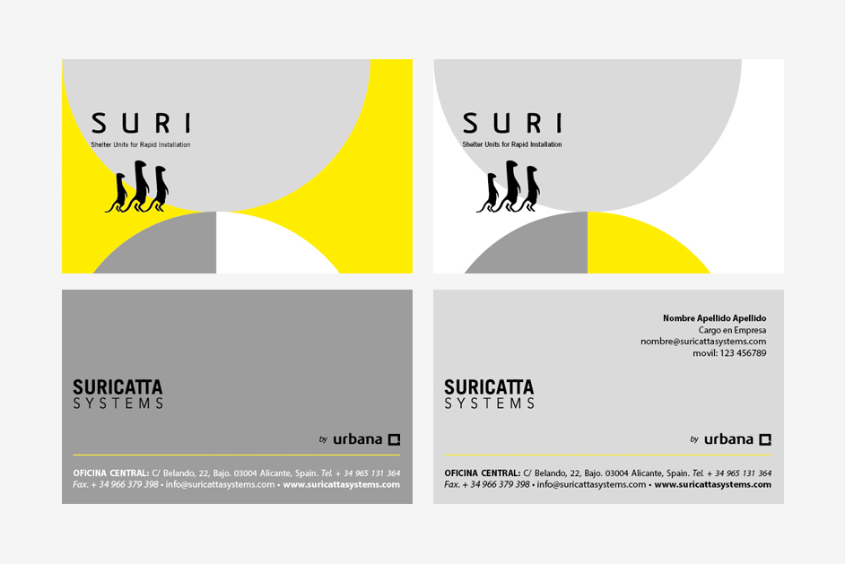
A visual identity that is recognizable, easily reproducible, and deeply aligned with the product’s mission. The brand logo effectively communicates the essence of simplicity, functionality, and speed. The minimalist design, with clean lines and the use of two-toned circles, symbolizes stability and adaptability, while the inclusion of stylized animals adds a sense of community and warmth, reflecting the brand’s humanitarian focus. The choice of monochromatic grey and vibrant yellow suggests a balance between reliability and optimism, appealing to the purpose of providing rapid shelter solutions. The visual identity is both modern and approachable, making it suitable for a brand centered on practical, emergency-driven solutions.
It communicates a strong sense of purpose and innovation through design. The choice of minimalist graphics, featuring stylized animals, evokes a sense of community, resilience, and cooperation—qualities essential for emergency housing solutions. The logo’s color palette, with its calming greys and vibrant yellow, suggests a balance between safety and hope, appealing to both practicality and the human spirit. The design’s simplicity allows for easy recognition, which is crucial in emergency and humanitarian contexts where quick identification is key. Overall, this branding is not only visually appealing but thoughtfully aligned with the brand’s mission to provide rapid and effective shelter solutions.
• Previous / Next •


