Client :
TIERRAS DEL CAFÉ / by Café Jurado
Actions :
Brand Logo / Corporate Identity / Illustration.
Packaging / Visual Identity.
Link / –
Share /
/ High quality coffee and franchise
Tierras del Café .-
/ The focus of “Tierras del Café” is on highlighting high-quality, regionally sourced beans, which might distinguish it from other lines within the Café Jurado brand.
COMMISSION ⌜
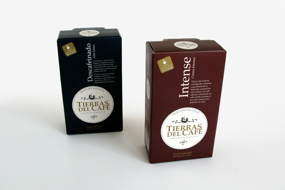
“Tierras del Café” by Café Jurado differs from regular Café Jurado in that it offers a more specific selection of coffee blends, primarily featuring Arabica beans from Central and South America. This blend is designed to have a rich, dense texture with both bitter and fruity notes, aimed at providing a more intense flavor experience.
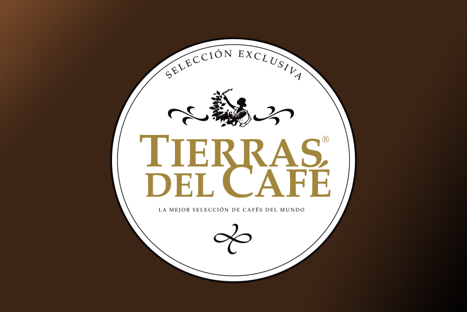
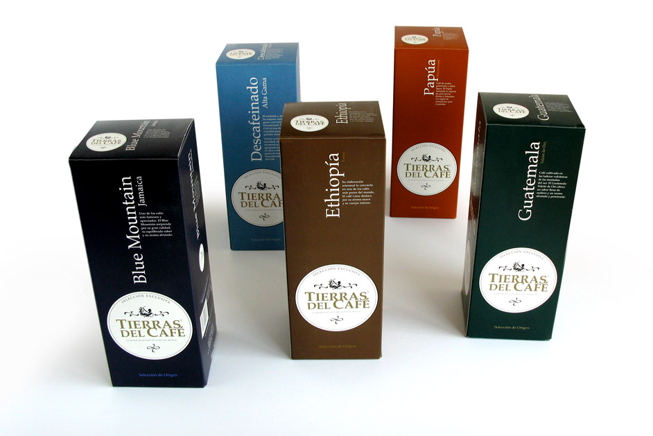
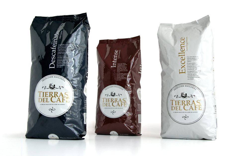
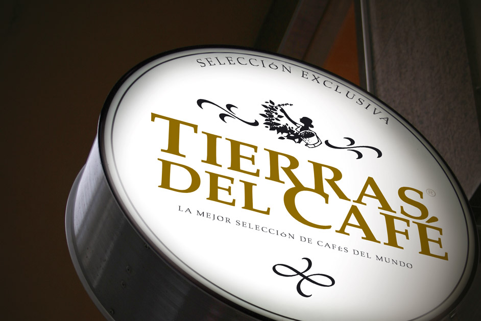
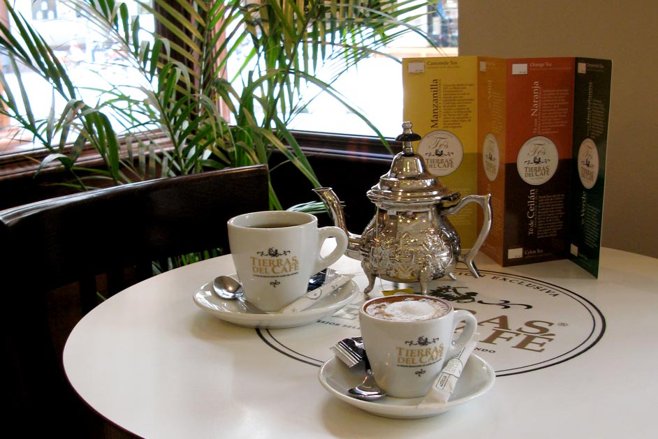
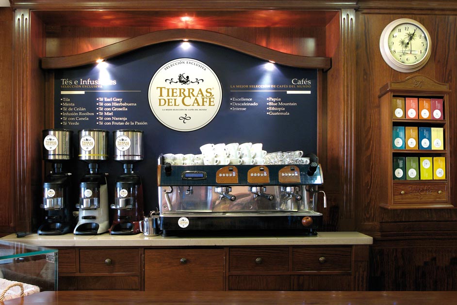
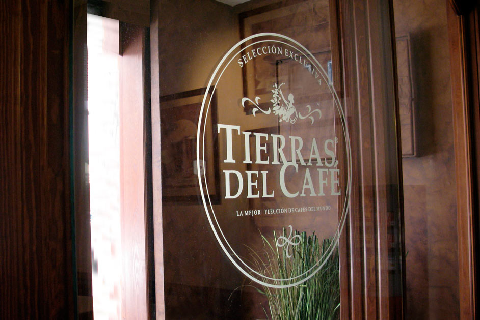
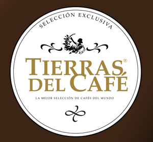
It was a global identity project for a franchise line of Café Jurado. Due to the exotic origins of its range of coffees, a colonial-style brand was created to evoke the origins of coffee, particularly African coffees. The overall design also serves as a seal, reminiscent of the screen-printed stamps used to personalize coffee sacks. We incorporated a more contemporary typographic tone to give the brand a current and distinctive personality.
The logo for Tierras del Café is a visually appealing and elegant design that effectively conveys the brand’s message of offering the finest coffee selection in the world. The circular shape creates a sense of unity and completeness, while the intricate details and gold accents add a touch of luxury and sophistication. The image of a woman harvesting coffee beans symbolizes the brand’s commitment to quality and craftsmanship. The tagline “La mejor selección de cafés del mundo” reinforces the brand’s claim to excellence and sets it apart from competitors. Overall, the logo is a strong and memorable representation of a brand that is passionate about coffee and dedicated to providing customers with the highest quality products.
• Previous / Next •
