Client :
VISSUM
Actions :
Brand Logo / Corporate Identity / Corporate Manual.
Naming / Visual Identity.
Link / –
Share /
/ Ophthalmological Institute
VISSUM .-
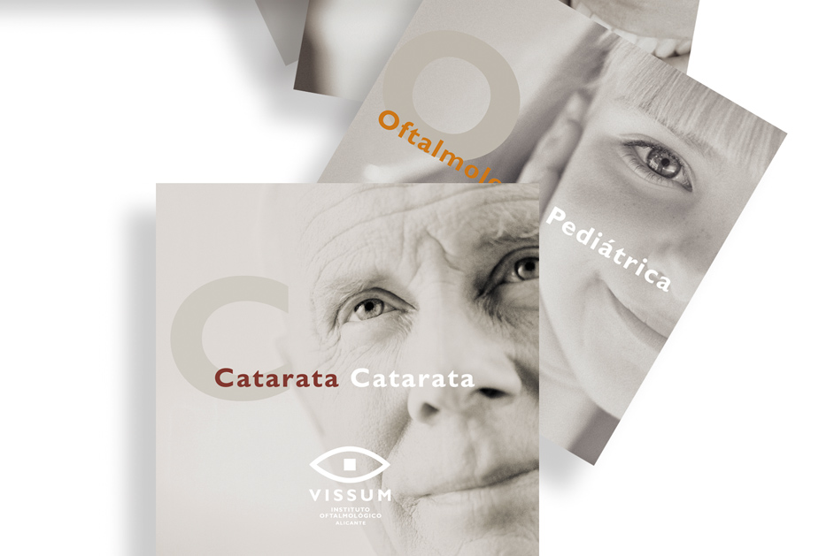
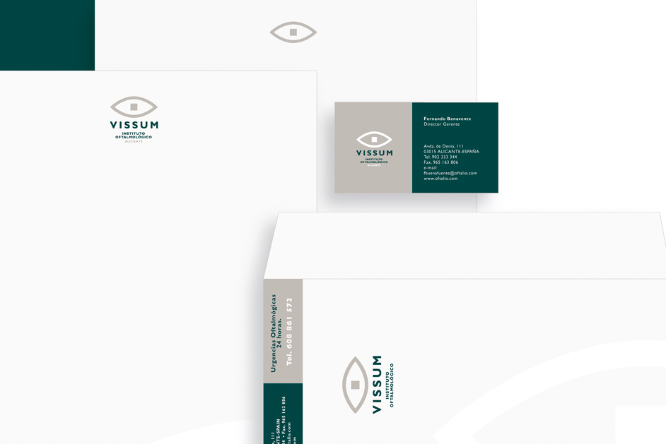
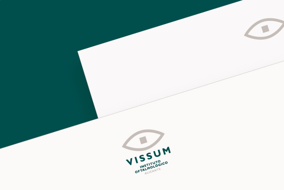
/ Renaming to align with its new strategic objectives. Redesigning its corporate image with a minimalist eye symbol and green tones to convey its brand essence.
CHALLENGE ⌜
The Alicante Ophthalmological Institute, in light of its expansion into other provinces, found the current name inadequate. The management team recognized that the company needed a branding project aligned with its new strategic objectives.
We were tasked with developing a name that reflected the new structure and complexity of the organization. We explored universal etymologies and sounds related to vision, ultimately concluding that “Vissum” was a fitting name for the new project.
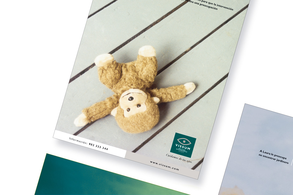
Regarding the corporate visual identity, we aimed to create a timeless image that could adapt to various communication elements.
ISOTYPE ⌜
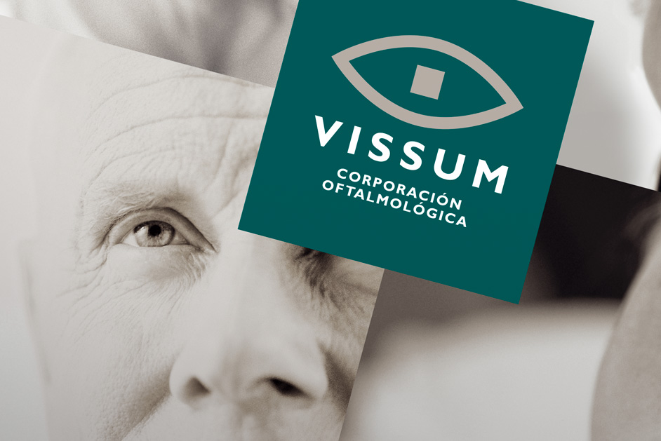
The brand’s isotype is based on a minimalist eye design featuring a square retina that appears circular as a whole. This visual effect seems to address the problem of squaring the circle, symbolizing the ability to make the impossible possible.
COLOR ⌜
Furthermore, the previous corporate colors of red and black did not convey the sense of trust and serenity that patients require when undergoing treatment in this type of clinic. For the corporate environment, we decided to incorporate large areas of green, ranging from forest green to technological green, which adequately represents the company’s character.
• Previous / Next •

